> ## Documentation Index
> Fetch the complete documentation index at: https://docs.kameleoon.com/llms.txt
> Use this file to discover all available pages before exploring further.
# Design your form
> Add and configure form elements like inputs, dropdowns, toggles, and checkboxes in the Widget Studio to build customized data collection forms.
Once you have created your widget in the Widget Studio, it's time to add elements to build your form.
## Form elements available
Click the left menu to add an element.
Scroll down to find the **Form** section. Several element types are available. You can mix and match to create personalized and interactive forms.
* **Button**: A button whose characteristics you can edit
* **Input**: A fully customizable text input that can collect **string** data from your visitors.
* **Date**: A field to request a date from your visitor. Click it to open a date picker panel.
* **Time**: A field to request a time from your visitor. Click it to open a time selection panel.
* **Toggle**: A toggle to which you can add two possible states (for example, **ON** and **OFF**).
* **Checkbox**: A checkbox to which you can add a Text element.
* **RadioButton**: A radio button to which you can add a Text element.
* **Select**: A fully customizable dropdown where you can fill in different selectable options.
* **Textarea**: A fully customizable text box containing a placeholder.
* **Range input**: A fully editable slider allowing visitors to select a value within a specific range.
* **Hidden input**: An invisible form field used to store metadata submitted with the form but not displayed to the user.
* **FormErrorMessage**: A text field displaying a specific message in case of an error on the form.
Start by adding elements in the **Desktop** view, which is the default configuration. Then, you can adapt your design to another device if needed (mobile/tablet). Changes made to another device remain specific to that device and will not impact the others.
## Designing your form
When you select an element, two tabs appear at the top of the editing menu: **General** and **States**.
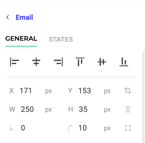
### General tab
Select this tab to edit your element's properties. Here, you will find your element's core properties (that are not specific to a particular state, such as hover).
You can modify different characteristics depending on the element type, like position, padding, and animation.
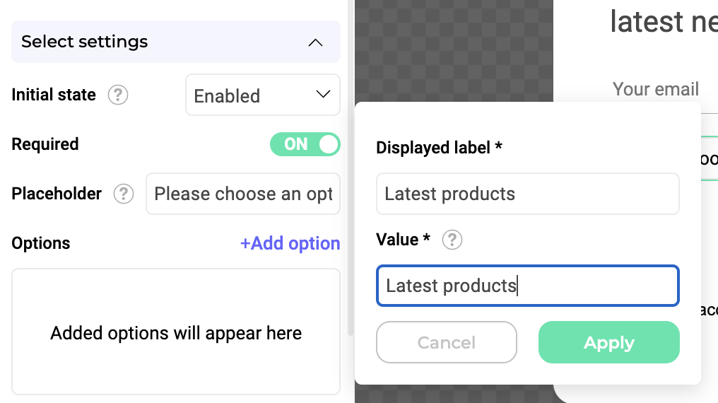
#### Use case example
Let's say you want to create a newsletter registration form. You can start from one of the **Newsletter** templates available in the Widget Studio. You can personalize this base by adding two dropdowns and a toggle. To create this form:
1. Click **Add an element**.
2. Choose the **Select** type in the forms section.
3. Click **Add option** to add an option to the list. For our example, we'll add the option **Latest products**.
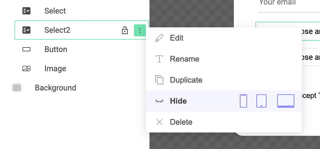
Let's say you want a second option that appears when a visitor selects **Latest products**. To do this:
1. Click **Add an element**.
2. Choose the **Select** type in the forms section.
3. In the left menu, hide the second dropdown. You will have to [configure an event](../associate-events-and-actions-with-your-widget) to make it appear.
4. Add a **Toggle** element to ask each visitor to accept the **Terms & conditions** before sending the form.
5. Add a **Button** element.
You must then configure the information's verification and the data's sending.
You can also [set rules for an element](./add-rules-to-your-form-fields): is this a mandatory field? Should we check the field's content before validating?
### States tab
The **States** tab lets you edit the styles of an element's states (hover, active, and disabled).
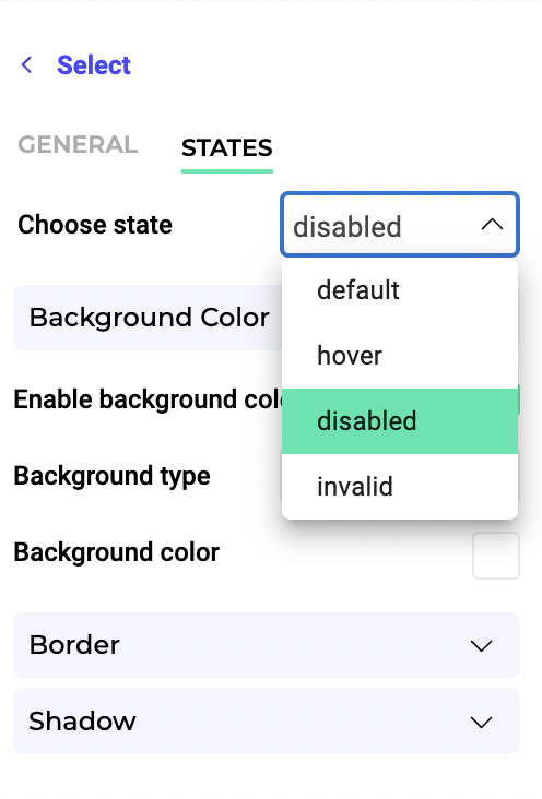
All states are editable, but states' editable properties depend on the selected element.